
Medicate
This was a very special project for me. The brief was to design a website that would solve a health problem of someone close to us.
I created a responsive website that functions as a medication library. The aim of this library is to help users be better informed about their health and the importance of the mediation they take.
This idea came to me when working in private healthcare. We didn’t have access to the NHS database so relied on patients to tell us what medication they were on before we could perform any kind of treatment. 9 times out of 10 they couldn’t tell me what they took, or what it did.
I began the design process for this project by conducting several interviews of people who fit within my user demographic, this analysed this data and used it to create user personas.
My next step was user journeys and page flows to help build a site map. Once these were all done I would know what my site needed to include and how it would function. Thus allowing for more appropriate sketches and wireframes.


Here we can see some of my initial sketches and how I developed them into a wire-frame.
In accordance with general UX conventions I have designed this project with a mobile first approach.
My user personas told me that there were a few things that it was important my site deliver.
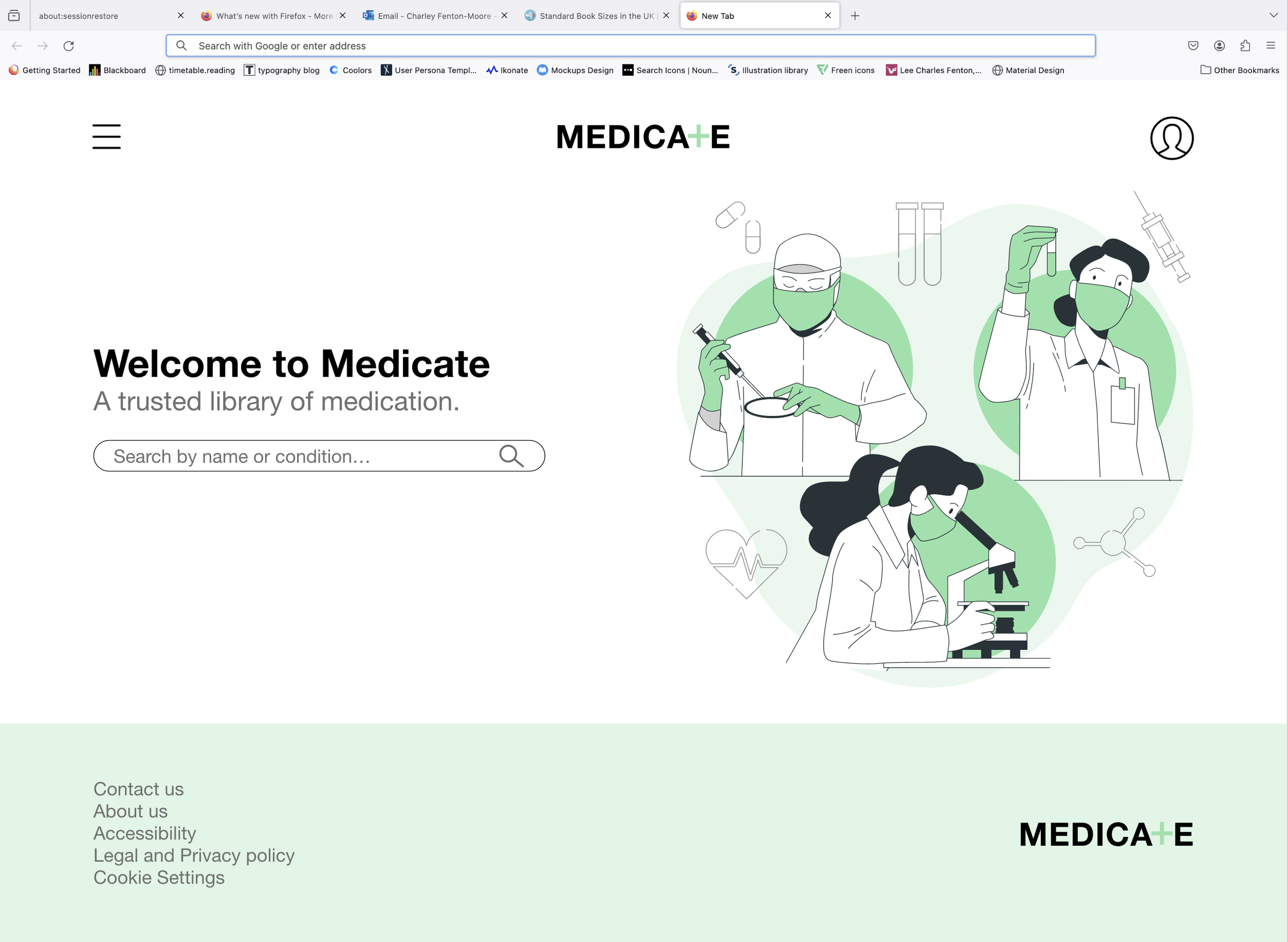
The first is the use of calming colours and illustrations. Too often medical website use harsh blues and cold images that create a stressful and clinical feeling experience. I want to provide an information without making the user uncomfortable. I have therefore used a calming sage colours palette and illustrations rather than images.
The second important element of my design is simplicity, it is likely my user base will be older and less computer literate. To cater to this market I have tried to limit the number of clicks and pages, I have also made call to actions very clear on each page.


This was my first responsive design project, I had to create a design that would work both in a small mobile format and on a large desktop screen. I have chosen a medication information page to best showcase how I handled the sizes.
On the desktop page I could clearly show all the information at once, however when I did this on the mobile version it felt like you were scrolling forever. To combat this issue I used both a drop down menu for the main sections of information and a separate page for the FAQs, this enables the user to chose exactly how much information is on display at any one time.
Something else I did to ensure consistency across my designs was use a type scale. This means no matter the size of the screen all the text will look proportional.

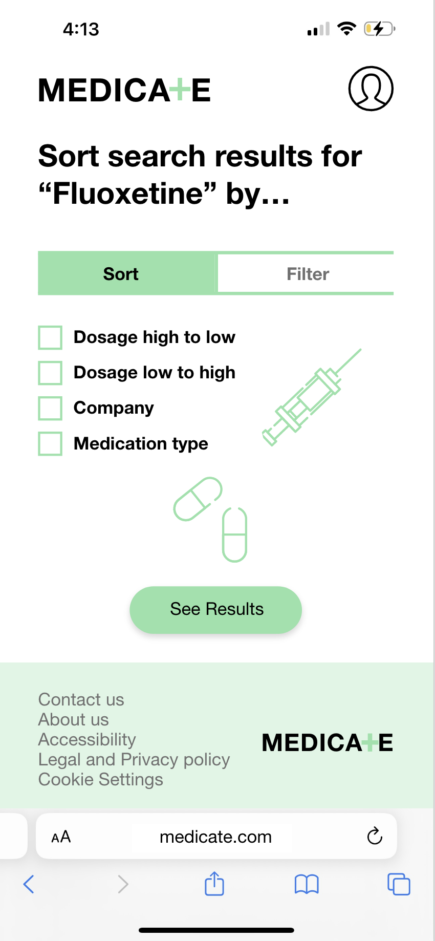
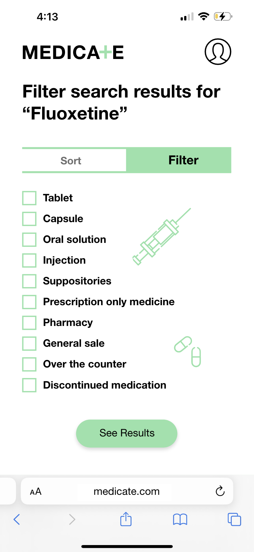
Another sizing challenge came when designing a search results page. Normally a website will have search and filter options, on a desktop they can easily be placed at the side to create live results updates and limit the number of clicks. For my mobile website I couldn’t do this due to space constrictions therefore, I created new pages that would allow the user to access the sort and filter options and then load a new set of search results..

Other pages


